

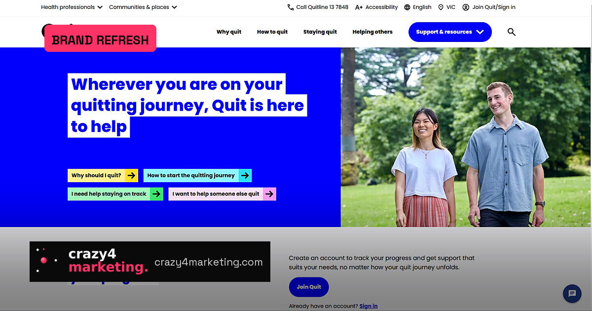
The 40-year-old Q had to flex
Cancer Council Victoria has just given Quit its most significant brand overhaul since the anti-smoking initiative launched in the 1970s. The reason is not nostalgia: smoking rates may be down, but vaping has built a new addiction cycle, especially among young Australians, and nicotine pouches are adding complexity.
The refresh was led by strategy firm Nature and design studio Studio Binocular. The brief? Keep the trust Quit has earned over four decades, but make the brand product-neutral enough to carry smoking, vaping, pouches and whatever the nicotine industry invents next.
“Quit has grown from a Victorian-based initiative into a national organisation helping Australians break free from smoking, vaping and nicotine addiction,” said Kelly Dienaar, Head of Cancer Control Media & Communications, Cancer Council Victoria.
The Q survives, but its meaning changes
Research showed the Q mark still carries enormous equity. The problem was its historic cigarette associations. Rather than retire the asset, Nature reframed it as a flexible identifier that can sit comfortably with any cessation need.
That is a classic brand-asset decision: when a logo is still trusted, you don’t discard it; you update the meaning around it. Studio Binocular then modernised the mark, colour system, language and imagery.
“We were determined to make sure the brand felt new, without feeling unfamiliar,” said Laura Cornhill, Creative Director, Studio Binocular.
What the relaunch teaches performance marketers
- Audit your distinctive assets before a rebrand — the Q was retained because it still had consumer recognition.
- Reframe rather than replace when a brand element carries legacy baggage.
- Design for a national network, not just a master brand; Quit’s system has to work across multiple partners and touchpoints.
The strategy underneath the new look
Nature anchored the core idea in possibility, the “why” that motivates someone to start quitting. That is a shift from fear-led messaging to support-led language, and it matches how modern health marketing works: meet people where they are, with accessible, personalised help.
Aliya Hasan, Head of Strategy at Nature, said the nicotine landscape and the communities Quit serves have become more complex. A brand that once could speak in one clear anti-smoking voice now has to talk to a generation that may have never smoked a cigarette.
Why this matters now
For Australian marketers, Quit is one of the country’s most recognised public health brands. The refresh is a case study in legacy brand modernisation: keeping the memory structure while shifting the story. The test will be whether the flexible Q can build the same recognition against a crowded, fast-changing nicotine market.
Source: Campaign Brief