
The image size specs for 2026 have landed, and the message is simpler than it looks. Every network still tweaks its numbers, but the core playbook for marketers has narrowed to a few rules that work almost everywhere.
The 1080-pixel rule still holds
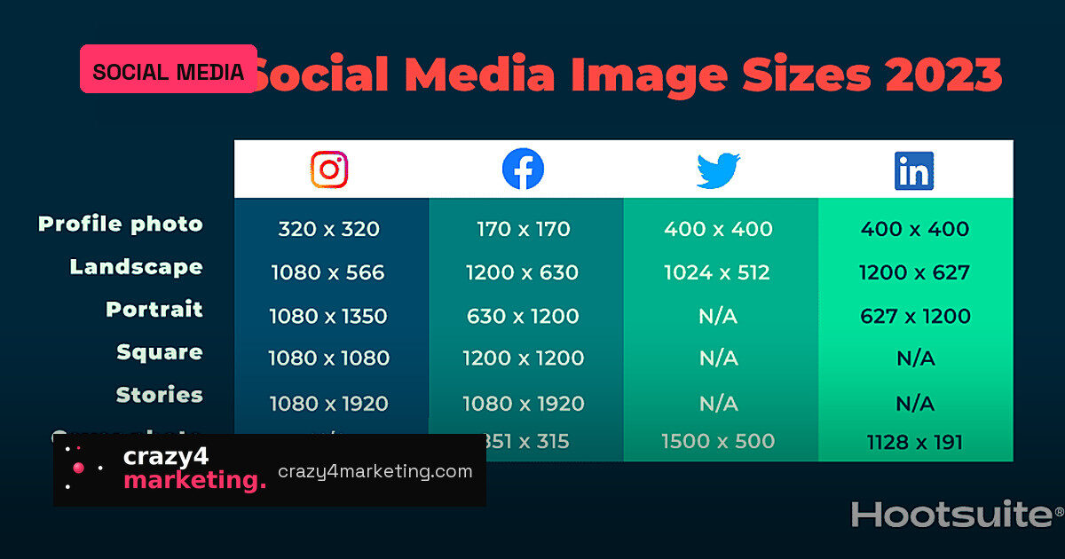
Most major platforms still recommend 1080 pixels as the width for feed images. Instagram and Facebook both keep vertical posts at 1080 x 1350, square posts at 1080 x 1080, and full-screen Stories or Reels at 1080 x 1920. TikTok’s carousel format also sits at 1080 x 1920. Below 320 pixels, platforms enlarge the file and it softens; above 1080 pixels, Instagram shrinks it anyway. Designing at 1080 means less compression and fewer unwanted crops.
Vertical formats have become the default
Mobile-first aspect ratios now outperform square in most placements. Instagram’s grid displays nearly every post as a vertical 1012 x 1350 crop, even when the in-feed version is landscape. Facebook’s feed vertical is 1080 x 1359. The takeaway: plan for 4:5 or 9:16 first, then adapt square as a safe alternative.
- Instagram feed: 1080 x 1350 vertical, 1080 x 1080 square, 1080 x 566 landscape.
- Instagram Stories/Reels: 1080 x 1920, with a safe area of 1080 x 1610.
- Facebook Stories/Reels: 1080 x 1920; feed vertical is 1080 x 1359.
- TikTok video and carousel: 1080 x 1920 for full-screen.
- LinkedIn: 1200 x 1200 for feed, 1200 x 627 for link previews.
Where the crop catches marketers out
Full-screen ad placements are the most dangerous for branded creative. Instagram and Facebook ask advertisers to leave roughly 14 percent of the top and 20 percent of the bottom clear of text, logos and other key elements on Stories ads. Instagram Reels ads go further, with 14 percent top, 35 percent bottom and 6 percent on each side. On X, the header can lose 60 pixels from top and bottom depending on the browser. LinkedIn cover photos change crop between mobile and desktop. The same centred-safe rule applies everywhere: keep the message in the middle.
Turn this into a repeatable system
Memorising every number is not the job. The better operating model is a small template library: one full-screen 1080 x 1920 master, one 1080 x 1350 feed master, and one 1:1 square fallback. Keep logos and text inside the safe zone by default. If your team publishes at volume, use a composer that already knows the latest specs. Perch by Hootsuite, for example, offers network-specific sizes from a drop-down inside its editor, so resizing is part of the publishing flow rather than a separate job.
The 2026 rule is simple: design vertical first, at 1080 pixels wide, and protect the centre. That keeps imagery sharp, keeps brand messaging visible, and avoids the engagement tax of a badly cropped post.