
Utilities rarely get credit for storytelling. Water Corporation is trying to change that. On September 28, the Western Australian water utility and The Brand Agency, Perth, launched ‘Water Colours the West’, a foundational education campaign that makes the state’s water story feel less like infrastructure and more like a brand promise.
The timing matters. WA is still growing, while climate change is permanently shrinking traditional rainfall. Water Corporation’s argument is that major projects and climate-resilient supply are necessary but not enough: long-term security depends on shared choices across households, industry and government.
Lisa Westcott, Team Lead Brand & Campaigns at Water Corporation, put it simply: “Water is behind almost every aspect of life in Western Australia, yet its value can often go unseen.”
How Watercolour Storytelling works
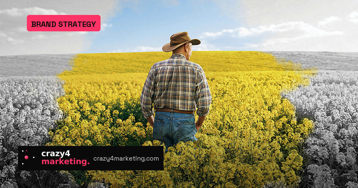
The campaign’s creative device is exactly what the name suggests. Black-and-white scenes of everyday West Australian life — from native residential gardens and construction sites to regional canola fields — turn vivid as pipes connect and water flows. One consistent visual transformation does the heavy lifting: grey to colour becomes a metaphor for water’s role in liveability, economy and environment.
Stephen Hansen, Associate Creative Director at The Brand Agency, said the device “manages to honour the importance of the message as well as celebrate the natural beauty of our state.”
Why the sequencing matters
Most behaviour-change campaigns jump straight to the ask: save water, use less, sign up. ‘Water Colours the West’ deliberately sits above those tactical messages. It establishes the ‘why’ first — the value water creates — and only then connects to social licence and specific behaviour-change initiatives.
Sophie Fielding, Senior Account Director at The Brand Agency, called it “a golden thread and brand foundation that will support community understanding and future water action for years to come.”
For marketers, that is the biggest lesson:
- Build the brand reason before you push the behaviour.
- Use a single visual device that travels across TV, OLV and out-of-home.
- Let a serious message feel calm and beautiful, not alarmist.
What to borrow for your next campaign
The watercolour device is a reminder that complex policy can fit into one memorable image. The campaign doesn’t explain every system pressure; it shows a pipeline turning a grey landscape into a living one. If you are trying to make an invisible product — insurance, software, infrastructure — find the moment it changes the frame, and film that.
The launch runs across TV, online video and out-of-home from September 28. The full credit list shows the machinery behind a simple idea: strategy, design, production and media working to keep the visual logic consistent wherever it appears.
That consistency is what makes a brand platform stick. Water Corporation isn’t asking for behaviour change in week one; it’s earning the permission to ask later.
Source: Campaign Brief